TT Interphases was designed by TypeType Team, Nadezhda Polomoshnova, Pavel Emelyanov, Marina Khodak, Kseniya Karataeva and published by TypeType. TT Interphases contains 24 styles and family package options. The font is currently #50 in Best Sellers.&nb
Useful links:
History of TT Interphases creation | Specimen | Graphic presentation at Behance
Based on the positive experience in creating typefaces such as TT Norms Pro, TT Commons and TT Hoves, we once came up with the ambitious idea of trying to create the perfect typeface to work in modern interfaces on most known mobile and web platforms. We took this project very seriously and, before proceeding with the design itself, we carried out rather extensive research work.
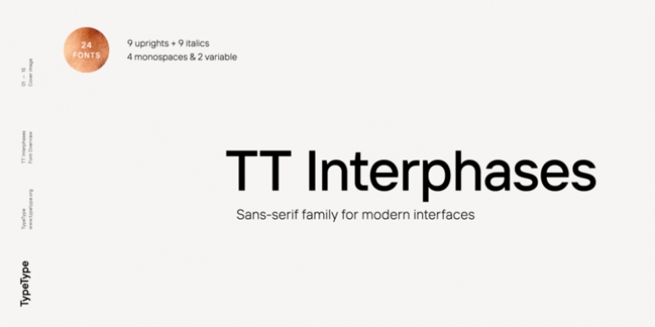
You can learn the detailed history of the typeface creation in the article by the link, and here we will tell you what we got in the end. TT Interfaces consists of 24 styles: 18 styles in the basic family, 4 monospaced fonts, and 2 variable fonts. The main visual features of TT Interphases include the open aperture of the characters, the uniform distribution of white and black, as well as excellent readability. The general neutrality of the font pattern is not without elegance, and all the details of the typeface are made with mathematical precision and love. In addition, TT Interphases has the most advanced manual TrueType hinting.
The basic TT Interphases family consists of 18 styles (9 weights and 9 obliques), in each of which there are more than 930+ glyphs. In the typeface, you can find old-style figures, stylistic alternates, mathematical signs, as well as 100 universal icons divided into five thematic groups: basic actions, states, sections of the site, documents and folders, mobile interface. TT Interphases supports more than 180 languages based on extended Latin and Cyrillic, including Bulgarian localization. And especially for those who are invested into the subject, we made two Variable fonts (Roman and Italic), which in their sign composition completely follow the basic set.
TT Interphases Mono is a complementary family of 4 styles (2 upright and 2 obliques), each of which consists of 740+ glyphs. We intentionally changed the sign composition of the Mono subfamily-we added special characters to the encoding and removed everything that was not needed (for example, ligatures). Although Mono borrowed the basic style-forming aspects of the main family, for example, the openness of the aperture or the degree of rounding of the circles, but due to the monospace, it adds some of his own character. First of all, this difference can be found in the changed design of signs, in noticeable visual compensators, as well as in italics, whose design is made in a more humanist way.