PR Vanaheim was designed by Peter Rempel and published by PR Fonts. PR Vanaheim contains 7 styles and family package options.
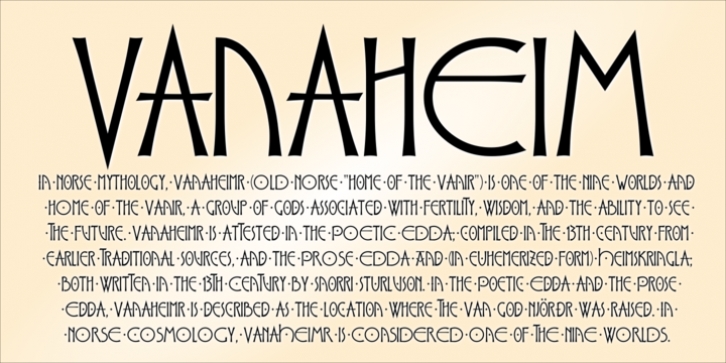
This is a perfect font for historical or fantasy titles. It is influenced by ancient Nordic runes. the strokes flare slightly, to a concave terminal for a finely carved appearance. There are two sets of capitals in PR-Vanaheim-DC (Dual Capitals); one set of narrow letters, more closely related to Runic forms, and one set which includes wider and circular letters, which can be freely combined with the narrow letters for the variety associated with hand lettering. There is one version with dots placed in the centre of large counters and one version without the dots.
The broad caps character set includes characters which allow for tight spacing; a dropped L, and a tall T.
There are also two different lowercase sets, one modern, and one archaic, all of which can be freely mixed to fine tune the appearance of your text.
Here is the brief description of the available faces:
PR-Vanaheim-Med-DC-01ttDuplex Caps
PR-Vanaheim-Med-DC-02ttDuplex Caps, Dotted counters and dot space
PR-Vanaheim-Med-DC-03ttDuplex Caps, Dotted counters
PR-Vanaheim-Med-LC-04ttBroad Caps, with modern style lower case.
PR-Vanaheim-Med-LC-05ttNarrow Caps, with modern style lower case.
PR-Vanaheim-Med-LC-06ttBroad Caps, with archaic lower case.
PR-Vanaheim-Med-LC-07t tNarrow Caps, with archaic lower case.