LF Spiegel was designed by Luc(as) de Groot and published by LucasFonts. LF Spiegel contains 12 styles and family package options.
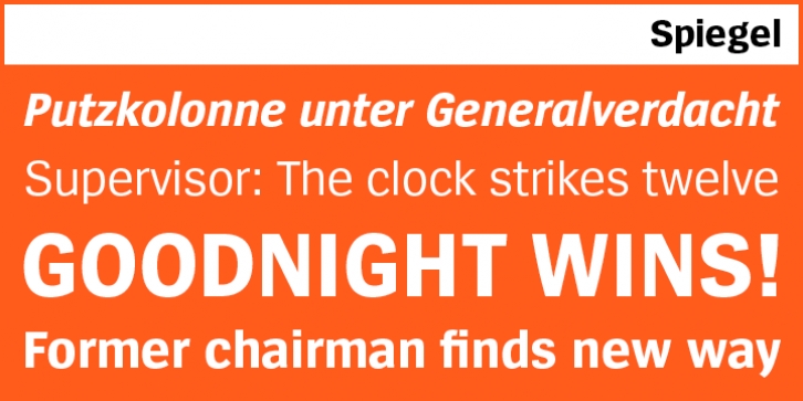
When approached to give informal advice on the redesign of the leading German weekly Der Spiegel, Luc(as) de Groot offered to design a completely new headline font. A newly developed typeface, he argued, would lend an unmistakable personality to the magazine. He worked late nights for a week and sent in sketches; the designers immediately ordered six weights. Says Luc(as): ‘I get a weekly free copy of the magazine as long as the typefaces are being used – it’s been ten years now.’
The Spiegel typeface embodies an interesting paradox: the shapes and proportions of an American-style gothic – the ultimate industrial typeface – are combined with the subtle diagonal stress and almost imperceptible traces of handwriting that are typical of most of Luc(as)’s text faces. Although conceived as a headline face, Spiegel is perfectly suited for medium-sized body text. Designers who can do without small caps and oldstyle figures will find it a pleasant, unobtrusive text face for brochures and illustrated books. The Condensed version is an elegant, spacing-saving headline font.
The current OpenType version includes character sets for dozens of languages including special sets for Central European, Baltic, Icelandic and Turkish.