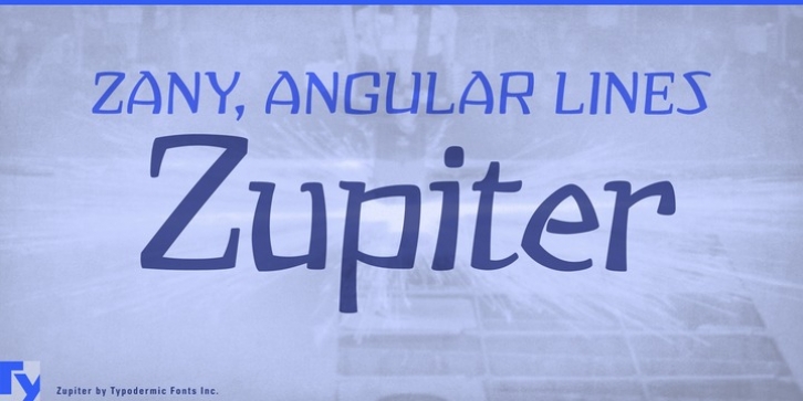
Zupiter was designed by Ray Larabie and published by Typodermic. Zupiter contains 1 style.
Every once in a while a weird font comes along that sets your graphics on its ear. Zupiter has that talent; its zany, angular lines make text look like it’s about to bounce off the page.

