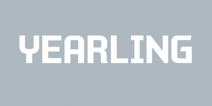
Yearling was designed by Chank Diesel and published by Chank. Yearling contains 4 styles and family package options.
The Yearling fonts are inspired by old propaganda poster letter forms of the 20th century. However, they’re also intended to work well in modern communications as well. Yearling was originally created to look good via fax (LOL!), and because it’s based on a very rigid grid (like pixels on your screen), this font family also works well on smartphones and modern tablets, too. Short on curves and diagonals, these letterforms are a celebration of horizontal and vertical. But most importantly, this font is simple and clean and clear and direct. Nothing fancy here, just the facts, as modern as can be. Recently updated with extra language support for many voices across the world.

