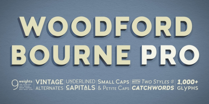
Woodford Bourne PRO was designed by Paulo Goode and published by Paulo Goode. Woodford Bourne PRO contains 18 styles and family package options.
Woodford Bourne PRO is the evolution of my original Woodford Bourne typeface that was inspired by the iconic stone cast letters on the façades of the 19th century Woodford, Bourne & Co. buildings in Cork City, Ireland.
Woodford Bourne PRO has matured with numerous improvements to make it an even more versatile font family. The fonts have been completely redrawn and spaced, there are now an additional 500 glyphs for you to use across 9 stylistic sets. The additions include underlined caps, small caps, petite caps, catchwords, discretionary ligatures and more. Please view the specification sheet before you purchase to see all the glyphs and features.
Key features:
• Woodford Bourne PRO is a vintage geometric sans, optically adjusted for improved aesthetics and legibility
• 2 FONTS IN 1 – Use the default contemporary character set, or switch to vintage style with stylistic sets
• 9 Weights in Roman and Italic
• Thin | ExtraLight | Light | Regular | Medium | SemiBold | Bold | Black | Ultra
• Underlined Caps, Small Caps, Petite Caps, Catchwords, Discretionary Ligatures
• Full European character set
• 1000+ glyphs per font

