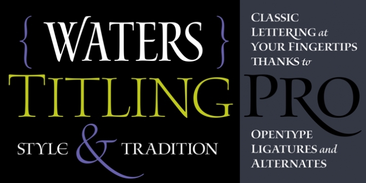
Waters Titling was designed by Julian Waters and published by Adobe. Waters Titling contains 12 styles and family package options.
In 1997, renowned lettering artist Julian Waters embodied his classical calligraphic roman capitals in a graceful typeface, aptly named Waters Titling. In 2001, the original design was enhanced and unified in the new OpenType format.
This broad-edged pen design is related to other historically-based titling alphabets but offers a wider range of weights and widths, making it a versatile choice for movie titles, book jackets, posters, banners, and calendars. Waters Titling is rooted in the timeless Roman monumental inscription forms of 2000 years ago, but is infused with contemporary vigor and flair. This calligraphic design has strong contrast between its thick and thin strokes, and flowing serifs with subtle brackets. In its lighter weights the design is elegant and delicate, while the bolder weights offer substance and sparkle.

