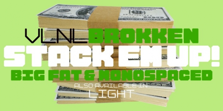
VLNL Brokken was designed by Donald Beekman and published by VetteLetters. VLNL Brokken contains 2 styles and family package options.
‘Brokken’ is the Dutch word for ‘chunks’. They are the hearty specialty of the house, prepared by the ship’s cook Donald DBXL Beekman. Nice’n’greasy and monospaced, you’ll always find a decent way to cram the letters in.
Brokken is straightforward, straight-lined with beveled corners, and all caps. For the ones who have to watch their weight, or who simple don’t like their fonts to be too fatty, DBXL designed a diet version called Brokken Light. With their big contrast, both weights combine very well and are great for making ultra-compact ribbon headlines or stacking vertically.

