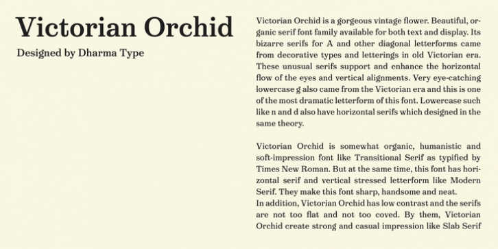
Victorian Orchid was designed by Ryoichi Tsunekawa and published by Dharma Type. Victorian Orchid contains 10 styles and family package options.
Victorian Orchid is a gorgeous vintage flower.
Victorian Orchid is a beautiful, organic serif font family available for both text and display.
Its bizarre serifs for A and other diagonal letterforms came from decorative types and letterings in old Victorian era.
These unusual serifs support and enhance the horizontal flow of the eyes and vertical alignments.
Very eye-catching lowercase g also came from the Victorian era and this is one of the most dramatic letterform of this font.
Lowercase such like n and d also have horizontal serifs which designed in the same theory.
Victorian Orchid is somewhat organic, humanistic and soft-impression font like Transitional Serif as typified by Times New Roman.
But at the same time, this font has horizontal serif and vertical stressed letterform like Modern Serif. They make this font sharp, handsome and neat.
In addition, Victorian Orchid has low contrast and the serifs are not too flat and not too coved. By them, Victorian Orchid create strong and casual impression like Slab Serif fonts.
Victorian Orchid family consist of 5 weights from Light to Bold including about 500 glyphs, international accented letters, some OpenType features.
Italics are ‘True’ italics which designed very carefully to match Romans.

