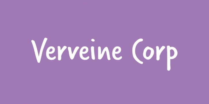
There is something delightfully brisk about Verveine. It has a familiar energy, like that of a shopping list quickly jotted down, but despite this vitality, the design of Verveine is considered and meets rigorous standards. Verveine is intended to be used at larger sizes – as a title in a book, or in packaging. It is most effective in short bursts – a few words, a tag line – to allow Verveine to support the message with its own expression.
Subtle stroke modulation and rounded terminals hint at writing with a felt pen; the strong weight suggests a fair amount of pressure applied, again indicating a brisk writing style. This is further emphasized by the condensed appearance and slight backwards slant, but to ensure that the agility does not descend into chaos, the design of every character has been tightly and meticulously controlled.
Verveine contains alternate designs for many characters, accessible via OpenType features in compatible applications, and the Corporate Edition includes Greek and Cyrillic to facilitate international use. A Standard Edition is also available.

