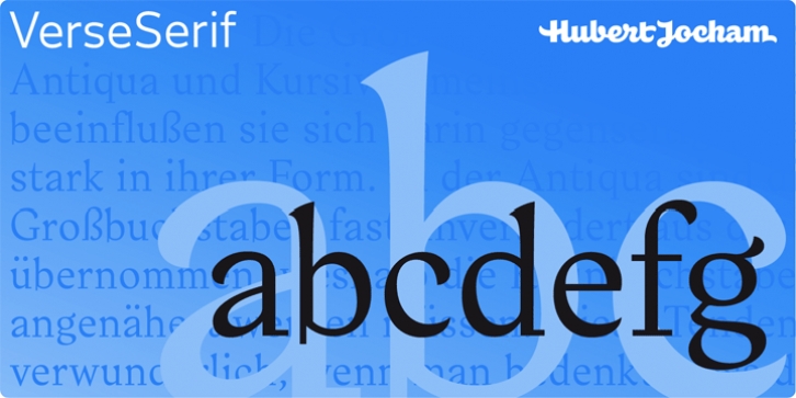
Verse Serif was designed by Hubert Jocham and published by Hubert Jocham Type. Verse Serif contains 14 styles and family package options.
In 2006 the art director of Emotion, a women’s psychology magazine, asked me to design a copy typeface for them. Before I actually got the job I started to work on a serif. I wanted it to be feminine but still clear and modern. On one hand there are the floral round elements and on the other hand the angular serifs.
In the composition I wanted the two extremes to work together. All the other elements had to be harmonized.
The proportions needed to match the magazine’s requirements. The ascenders and descenders are short enough to work in narrow columns but long enough to work in small sizes.
As you can imagine, the emotion-job never happened. Verse is now a serif and a san-serif with 7 weights with italics and smallcaps.
In copy you should not get heavier than Heavy. Extrabold and Ultrabold work best in display.

