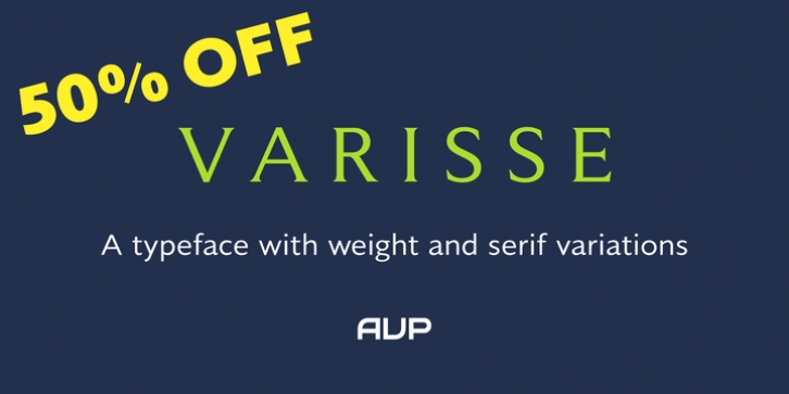
Varisse was designed by Nicholas Garner and published by AVP. Varisse contains 60 styles and family package options. The font is currently #31 in Hot New Fonts.
Varisse spans over two centuries of type design and draws its inspiration from well-loved classics that are as fresh today as they were when they were created.
The range stretches from a quintessential 18th century transitional serif to an uncompromising 20th century sans. Think Baskerville, think Gill. The idea was to create a family that shared similar forms and the same vertical metrics, allowing them to be mixed to provide impact and readability as required.
With a generous x-height and a host of options, the Varisse family is ideally suited to branding, packaging, magazines and editorial. It also provides a wealth of opportunity in website presentation.
The fonts are divided into five subfamilies by degree of ‘serification’.
Varisse SansVarisse Soft SansVarisse (normal)Varisse Soft SerifVarisse Serif
Each subfamily contains six weights and accompanying italics.

