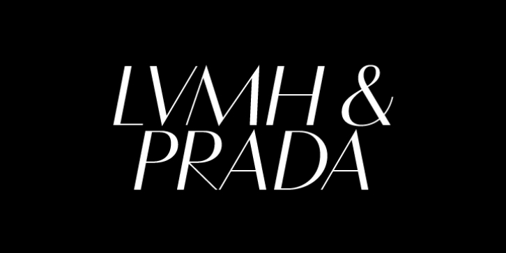
Vanitas was designed by Michael Jarboe and published by Reserves. Vanitas contains 8 styles and family package options.
Vanitas is an elegant high contrast contemporary sans. It is rooted in the style of a classic didone, excluding the typical serifs and ball terminals as well as being designed with a cleaner, more reductionist appearance. Strict attention was given to the cohesiveness and balance between letterforms as well as the careful refinement of all curves.
Stylistically, Vanitas‘ alluring, sophisticated sensibility is directly inspired by high fashion. The upright styles are complimented by a pairing of optically adjusted true italics, which were purposefully adapted to retain the sharpness of their counterparts. Abandoning traditionally executed cursive italic letterforms retains Vanitas‘ sharp characteristic through each style.
Features include:
Precision kerning
Standard Ligatures set including ‘f’ ligatures (fb, ff, fh, fi, fj, fk, fl ffb, ffh, ffi, ffj, ffk, ffl, ffy, ae, oe, AE, OE)
Discretionary Ligatures set including (st, ct, No)
Alternate characters (H, A, AE, Q, $, h circumflex, ¶ and numero sign)
Case forms (shifts various punctuation marks up to a position that works better with all-capital sequences)
Capital Spacing (globally adjusts inter-glyph spacing for all-capital text)
Slashed zero
Full set of numerators/denominators
Tabular Lining, Proportional Lining, Tabular Oldstyle and Proportional Oldstyle Figures
Automatic fraction feature (supports any fraction combination)
Extended language support (Latin-1 and Latin Extended-A)
*Requires an application with OpenType and/or Unicode support.

