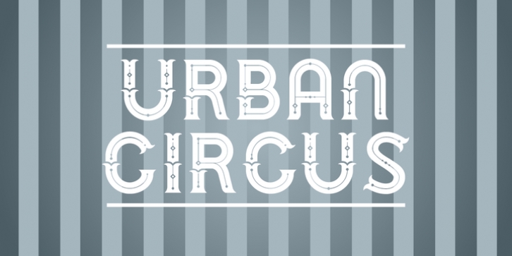
Urban Circus was designed by Chank Diesel, Robert Pflaum and published by Chank. Urban Circus contains 4 styles and family package options.
Urban Circus is a big, grand display font that celebrates both the thoughtful, carefully constructed elements of contemporary urban planning and also the joyful, chaotic and magical elements of the circus. This typeface comes in four font styles which have a total of eight different alphabets that can be used together to create dramatic poster headlines and titles. Use the different alphabets on overlapping layers in different colors for a striking poster effect.
The basic concept for this font came from a big fancy T that was drawn for a poster for an event at the Minneapolis Institute of Arts. At the event, MIA visitors were invited to spontaneously craft a letter out of play-dough, yielding a fun-filled assortment of letters and numbers inspired by that big ol’ T. That workshop event yielded a fun photofont that helped fuel the direction for what eventually became the Urban Circus font. The characters here have all been carefully re-drawn with crisp, clean lines while retaining a fanciful, spontaneous character.

