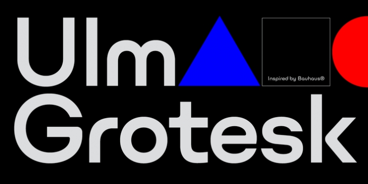
Ulm Grotesk was designed by Ilya Naumoff and published by Indian Type Foundry. Ulm Grotesk contains 5 styles and family package options.
Ulm Grotesk is a family of geometric-style fonts for use at display sizes. Its design is so simplified that it feels quite futuristic. There are five weights on offer, ranging from Light to Extra Bold. The characters have been drawn with optically-monolinear strokes. The capital letters contain quite a lot of character; some of them are markant, too. The ‘J’, for instance, is very wide. The fonts’ default ‘Q’ separates the ‘O’ stroke from the tail visibly; a more traditional-looking ‘Q’ is available as an alternate. The forms of the capital ‘A’, ‘V’, ‘W’, and ‘Y’ are reminiscent of the ‘worm logo’ that was used by NASA in the 1970s and ’80s. The lowercase ‘m’, ‘n’, ‘r’, and ‘u’ are spurless. The high-modernist geometric style of the ‘a’, ‘b’, and ‘c’ call Paul Rand’s iconic ABC logo to mind. The tail of the ‘j’ is a simple, vertical stroke. The ‘g’ and the ‘y’ each have wide, sweeping tails – although, there is an alternate ‘y’ available, with a straight-tailed descender. The fonts’ numerals are the same height as the capital letters. Ulm Grotesk is named after the German city of Ulm. In the 1950’s and ’60s, a famous West German design school operated there. The Ulm School of Design was hailed as a successor to the Bauhaus, and it set important impulses for international graphic and product design. These Ulm aftershocks were felt for the next several decades. The fonts are the work of the Paris-based type designer Ilya Naumoff.

