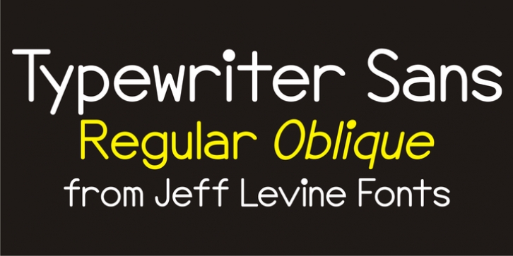
Typewriter Sans JNL was designed by Jeff Levine and published by Jeff Levine. Typewriter Sans JNL contains 2 styles and family package options.
At first glance, Typewriter Sans JNL seems to look like the pantograph lettering of an engraved sign or the rounded-end lettering from an architect’s templates. It might also be mistaken for plastic pin-back lettering used on some bulletin boards.
In actuality, the design is based on examples of an electric typewriter ball element with a sans font named ‘Dual Gothic’, suggested for use ‘in credit reports and other financial applications’.

