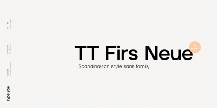
TT Firs Neue was designed by Ivan Gladkikh, TypeType Team, Philipp Nurullin and published by TypeType. TT Firs Neue contains 19 styles and family package options.
What’s new? We have made a variable version of TT Firs Neue!
The variable version of the TT Firs Neue allows you to select and set up any custom weight of letters that range from Thin to Black. Important note, at the moment the TT Firs Neue variable font does not support oblique/italics and only work with upright styles. And of course, when you buy a full family, you get the variable font for free.
TT Firs Neue is a contemporary reincarnation of the good old Scandinavian TT Firs sans-serif. In the process of updating the old typeface, we realized that the number of innovations and the amount of work done definitely deserve a full-fledged new release, and thus TT Firs Neue has come to life.
What has changed? Everything, starting from the proportions of letters and ending with a new formula for the interpolation of weights! So, we changed the proportions of uppercase and lowercase characters; corrected the difference in weight between the letters in fonts of different weights. We changed the basic thicknesses of the strokes so that none of their 18 fonts would stand out with their weight and would be completed following a strict system. We created completely new Italics. And, of course, we made changes directly to the style of the typeface and its letters-the letters have become fresher and cleaner from the geometric point of view.
The most interesting change in the font is the significant extension of its scope. While the old type family was primarily focused on display matters-that is, very large short inscriptions, the new version implies active use of the typeface in the text and on the web. With all this, the font’s character has not been weakened, but has even gained some more strength. This can be perfectly seen in the radical extenders of the letters gltf, or in the super-display visual compensators for horizontal strokes in the bold weights of the typeface. Even though the standard display of TT Firs Neue has become brighter and more audacious, you can always calm it down a little by simply turning on stylistic alternates.
And that is not all! And how about small capitals, and other OpenType features, you ask? In TT Firs Neue, you will find small caps (for Latin and Cyrillic alphabets) and a set of stylistic alternates. In addition to the ‘standard ligatures’, in TT Firs Neue you can find a large number of original ligatures (30 items) for capital letters, which cover popular two- and three-letter high-frequency combinations from Scandinavian languages. In addition, to support the linguistic features of Scandinavian countries, we prepared a set of capital letters with pinned-down diacritics (including their small capital versions). To access this function, you need to use the calt feature (contextual alternates), or enable the second stylistic set (ss02) in InDesign. And that’s not all, there are a lot of useful features in TT Firs Neue, such as: ordn, case, c2sc, smcp, ccmp, frac, sinf, sups, numr, dnom, tnum, onum, lnum, pnum, dlig, liga , salt (ss01), ss02, locl, calt.
Useful links:
TT Firs Neue PDF Type Specimen
TT Firs Neue graphic presentation at Behance

