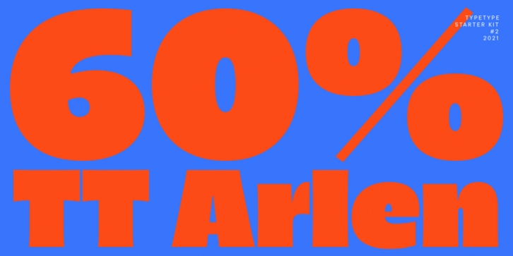
TT Arlen was designed by TypeType Team, Yulia Gonina, Eugene Tantsurin and published by TypeType. TT Arlen contains 7 styles and family package options. The font is currently #16 in Hot New Fonts.
Meet a bright and expressive grotesque with a delicate yet daring character!
The concept of TT Arlen evolved from a small sketch into a full-fledged font family with strong contrast, small inter-letter spacing and original visual presentation.
TT Arlen is a catchy sans-serif suitable for branding and headings. Depending on the context of the project, the typeface can change its character from playful to aesthetically delicate. TT Arlen is based on a humanist grotesque suggested by the open apertures and friendly mood. However, in the first place, our font family attracts the viewer with its display character, not its construction.
Visually, TT Arlen is easy to recognize among other humanist grotesques. Large letters with a minimum of white, stem thickenings, little contrast between uppercase and lowercase, high setting density. At the same time, diacritics are quite subtle, which gives font family additional originality. Another visual trick is the lowercase i and j, which jump into the line.
The TT Arlen font family consists of 7 styles: 6 widths and 1 variable font. Each style contains 587 glyphs. The font family contains 21 OpenType features, where, in addition to the standard ones, there are an additional set of characters, thick diacritics instead of thin ones, alternative glyphs (single storey letter a, modified form g, y, u), jumping into the i and j strings. TT Arlen contains a large number of ligatures.

