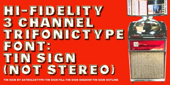
Tin Sign was designed by Glenn Parsons and published by astroluxtype. Tin Sign contains 3 styles and family package options.
A new “Trifonictype” font (Barn Owl the 1st) from astroluxtype. It’s three fonts in one. Tin Sign can be used to create special typographic “effects” in your image manipulation program and other apps as you change opacity, layering etc. to get a wide range of different looks to the three components to this font. Bold. Distressed. Vintage. Dimensional. This is a display/headline only font recommended to be used larger than 36pt. It is letter spaced open, but by using letterspacing in your app you can customize the look to your desired spacing. Tin Sign Fill, Tin Sign Shadow and Tin Sign Outline can be used together or separate to create a new look each time you use them. Shadow can be in the back or front which shows the interior shadow on the glyph. It is a minimal/basic font set. It is an all uppercase font with a small mix of lowercase glyphs in the lowercase positions. These bring an additional element/look to your design should you choose to include them. How Tin Sign works, type your headline, copy it and paste it in front or back. Choose a different component of the font, do it a third time with again a different component of the font pasted in back (or front) choose a new color at each step and see the results. In your application play with transparency and other effects to get the font artwork that you desire. Tin Sign brings multiple possibilities to your layouts and design with its modular components that lend themselves to manipulation and exploration.

