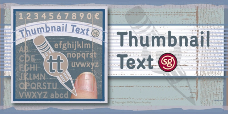
Thumbnail Text SG was designed by Jim Spiece and published by Spiece Graphics. Thumbnail Text SG contains 1 style.
With its slightly rough edges, Thumbnail Text works well where lettering is required. Letterforms wiggle a bit here and there but are generally quite uniform. Characters are a bit imprecise – but not showy or bouncy. They appear more adult-looking than childish and are very legible.
Put Thumbnail Text to work as drafting notation or on blueprint projects that need to be easily read. It¹s also useful when concept or sketch stage lettering needs to look serious but not highly stylized. You might experiment with it inside cartoon thought balloons or in callouts.
This design is based on an old showcard style from the 1940s. It’s been dusted off and reissued for modern use. A lowercase has been added for greater functionality.
Thumbnail Text Regular is now available in the OpenType Std format. Some additional characters have been added to this OpenType version as stylistic alternates. This advanced feature works in current versions of Adobe Creative Suite InDesign, Creative Suite Illustrator, and Quark XPress. Check for OpenType advanced feature support in other applications as it gradually becomes available with upgrades.

