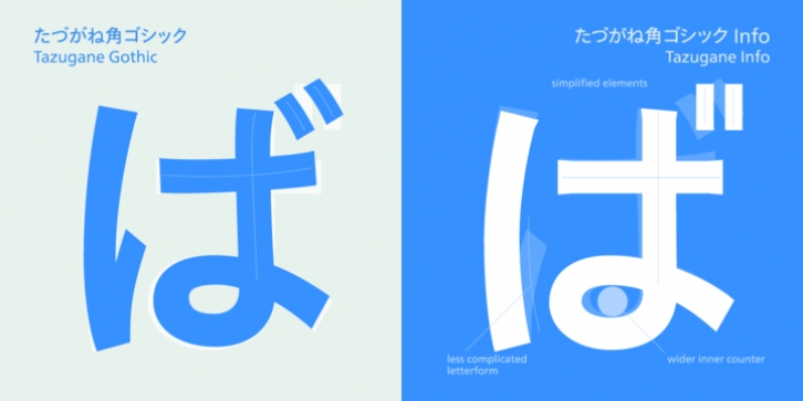
Tazugane Info was designed by Monotype Studio and published by Monotype. Tazugane Info contains 10 styles and family package options.
Tazugane Info is a screen-ready Japanese font family, that follows on the debut of Monotype’s first original Japanese typeface – Tazugane Gothic. It offers a more restrained personality, with calligraphic design details pared back to create a geometric letterform – a good alternative for designers looking for a matter-of-fact alternative to the warmer Tazugane Gothic tone of voice.
Tazugane Info was updated to support the “Reiwa” new era symbol. Reiwa can be written as two kanji: 令和. This update to Tazugane Info includes Reiwa designed as a single ligature and is encoded as U+32FF.
“While Tazugane Gothic fits perfectly when your job requires an organic and friendly tone of voice, Tazugane Info provides a more solid look,” says Kobayashi. “I hope that having two options will make it easier to choose an appropriate tone of voice to convey information or brand messaging.”
Its strokes create a smooth uninterrupted flow that’s designed for use on-screen. Although books, newspapers and magazines are traditionally set vertically in Japan, smartphones, information panels and car navigation systems are all set horizontally – and Tazugane Info has been tailored to this environment, featuring a new set of kana phonetic symbols.
Tazugane Info is available in 10 weights, and includes the complete set of kanji and latin found in Tazugane Gothic.

