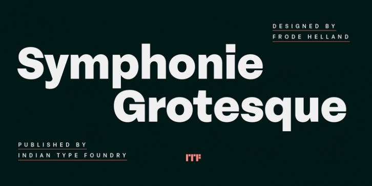
Symphonie Grotesque was designed by Frode Helland and published by Indian Type Foundry. Symphonie Grotesque contains 10 styles and family package options.
Symphonie Grotesque is a family of neo-Grotesque-style sans serif fonts. There are five different weights available, ranging from Regular through Heavy. Each weight has an upright and an italic font on offer. Symphonie Grotesque‘s italics are what really set it apart from other neo-Grotesque families. Instead of just offering slanted, or oblique versions of the upright fonts’ letters, Symphonie Grotesque‘s italic fonts include several unique, more cursive-style letterforms. For example, in Symphonie Grotesque‘s upright fonts, the ‘a’ is double-storey, while the ‘g’ is single-storey (just what one would expect for a typeface of this genre). But in the italics, the ‘a’ becomes single-storey, and the ‘f’and ‘ß’ get descending tails, too. Symphonie Grotesque‘s numerals are tabular lining figures; the ‘1’ always has a nice, wide base-stroke at its bottom. The middle-two diagonal-strokes of the ‘M’ remain visibly above the baseline in all of the family’s styles. The fonts’ ascenders rise quite a bit above the tops of the capital letters, but the capitals and the numerals both share the same height. Symphonie Grotesque is an excellent selection for use in branding or in other kinds of corporate identity design. It will surely also come into good use in design for galleries and publications about contemporary art. Symphonie Grotesque is the work of Frode Helland, a type designer from Norway.

