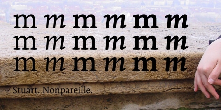
Punchcutters (when types had to be cut, and not just drawn), were working with steel, a strong metal they had to sculpt. They were subject to physical contingencies: each type cast was engraved separately and, as we move down into the smaller type sizes, the drawing was adapted to new specific data encountered — fine hairlines—hence fragile—need to be reinforced, the curves simplified and the width spacing slightly increased to prevent the ink from clogging up the composition. So, each body size had its own drawing, mostly given by merely physical limits relating to the dexterity and eyesight of the punchcutter… and of the reader, too.
Whereas nowadays it is easier to move from one type size to another, most digital fonts offer us just ONE design, irrespective of the chosen type size. Although computers free us from a lot of the restrictive physical aspects of lead composition, will we not be throwing the baby out with the bathwater and losing an essential subtlety? Where the cutter’s corrections not an integral part of ensuring that a text was properly legible — of its beauty — instead of being no more than a technical defect with which the computer has successfully done away?
The Stuart font restores links to this lost way of doing things by offering three designs for a single font. First of all the Stuart caption, which is suitable for use with type sizes of below 8 points; it has the characteristics of small sizes types: downstrokes and hairlines not particularly marked, wider spacing and solid shapes. On the contrary, at the other end of the scale the Stuart titling, designed for type sizes of over 12 points, has marked downstrokes and hairlines, a narrower width spacing and a certain lightness of shape. Between the two, for type sizes between 8 and 12 points (the most commonly used) there is the Stuart text.
Stuart is designed for graphic design with good resistance for long (in theory literary) texts. Based on a venetian style, with “latin†curves moderated by a strict modernist regularity, it is available for all european languages, and offers a very wide range of signs, like three styles of figures and mathematical signs, small capitals, ligatures, exponent, fractions, etc.
It is available in regular, medium and bold weights, each of them broken down into roman and italic styles.
For general users, it can be bought in “standard” version, divided in OSF (Old style figures) for long texts, TLF (Tabular Lining Figures) for tables, PLF (Proportional lining figures) for titles entirely in capitals, and SC (Small capitals) with lower case replaced by small caps.
For the special needs of precision, subtleties and refinements for graphic and book designers, there is also a more complete “pro†version. All the varieties of the standard version are here folded in one single font. It also provided extra ligatures, superiors, inferiors, and fractions that the standard version do not.

