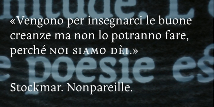
Long-time work of a revival of a baroque font of 1720, after Johann Rudolf Genath II, Stockmar was primarily designed with three italics (more or less geometrical, cursive, dynamic). This work and details can be read on www.nonpareille.net.
Nevertheless, after a few years of use, this font had to be corrected and improved. So, Stockmar ’new cut‘ still offers small capitals, special ligatures, fractions and exponent figures, but have a unique italic, more easy to use than three. The drawing of most part of the letters have been reshaped for a firmly and strong result: a perfect typeface for long distance literary texts.
Two version are available: standard and pro.

