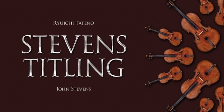
Stevens Titling was designed by Ryuichi Tateno, John Stevens and published by Linotype. Stevens Titling contains 8 styles and family package options.
Stevens Titling refers to the classic Roman alphabet as it appears on the Trajan column and numerous other monuments. With its realistic brush strokes, it shows the letterforms as they might have been sketched on the marble before the stonecutter reached for his hammer and chisel.
The four fonts that constitute the Stevens Titling suite are named after animals – badger, boar, sable and wolf –, each known for the specific character of its hairs when used to make painting brushes.
Sable Brush is the most formal and elegant, with solid forms which show no obvious trace of the handdrawn brush stroke; it comes with a set of small capitals for those classical titles preferred by Hollywood. In fact, each of these fonts would do a great job as a film title and poster font. The Badger Brush variant is compact and firm; Boar Brush is dramatic, and in Wolf Brush each part of the letter is made up of realistic, dry strokes.

