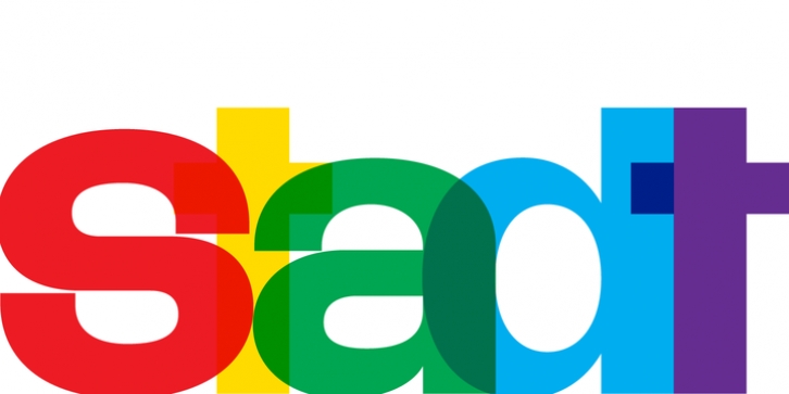
Stadt was designed by Michael Cina and published by Associated Typographics. Stadt contains 1 style.
Stadt seamlessly combines typographic aesthetics from the 1950’s with a contemporary twist. This workhorse is meant to be set tightly, but looks equally smart with some extra space as well. We loaded Stadt with alternate characters and ligatures along with wide language support.
Every glyph is immaculately drawn, spaced and kerned. With a full house of over 400 characters, Stadt brought me back to my early days of font-making. When I had an idea, I’d run with it, burning through the work straight for a week or two. Stadt came to me at time during which a project was put on hold so I concentrated on creating the bones of this typeface from morning to night. A month later, it is now available for you to use.
I thank you for your continued support of my work. Enjoy!

