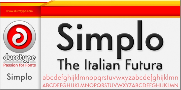
Simplo was designed by Alessandro Butti, Ben Blom and published by Durotype. Simplo contains 17 styles and family package options.
Simplo: the ‘Italian Futura’.
Simplo is a geometric sans serif typeface, built in sixteen styles. It is a tribute to the 1930s typeface Semplicità , designed by Nebiolo’s Alessandro Butti. Although many details of Simplo differ from Semplicità , it preserves the spirit of the original.
Simplo is ideal for use in display sizes. It is also quite legible in text, and is well suited for graphic design and corporate identity design. Simplo has sixteen styles, extensive language support, eight different kinds of figures, sophisticated OpenType features – so it’s ready for advanced typographic projects.
The most notable characteristics of this typeface are the t and the f. The t is the culmination of simplicity: a vertical line with just a simple right-side crossbar. The f also has just a right-side crossbar, and is really tall: it reaches both the highest and lowest vertical position of the typeface. The top of the distinctive s, is much narrower than its bottom. The a, b, d, g, p, q, and u are spurless, and show a family resemblance with Hans Reichel’s 1990s typeface Dax. However, these letters are rounder and more geometric than Dax’s counterparts, because of Dax’s higher x-height and narrower design. In Paul Shaw’s Imprint article about typefaces that have been overlooked and/or underappreciated, “Overlooked Typefaces”, he concluded his discussion of Semplicità as follows: “These idiosyncrasies suggest that Semplicità might find a warm reception today, given the current love affair with Gotham, Neutraface and Proxima-and the resurgence of ITC Avant-Garde Gothic.”
For more information about Simplo, download the PDF Specimen Manual.

