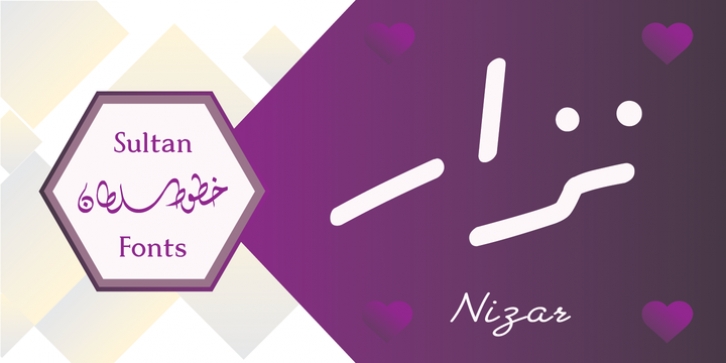
SF Nizar was designed by Sultan Maqtari and published by Sultan Fonts. SF Nizar contains 1 style.
In July 2014, using my light pen, I completed the work in designing the font – Nizar, which was named in honor of the great poet Nizar Qabbani who inspired millions through poetry and prose. The font depends mainly on the characteristics of the traditional Ruq’ah handwriting, but the spirit of the letters tend to embrace the distinguished style that we knew of the poet in his hand-written poetry books.
Due to the fact that I could not find all the alphabets in the great poet’s handwriting, I adopted the method of measurement and prediction for structure of the missing letters, Which resulted in a new style of the Ruq’ah Typeface; a closer look at the font highlights the common characteristics of all the usual Ruq’ah writings, which are the height of the character ‘Alef’ and spaces and formation on the line, the contextual replacement and convergence of when a letter meets another, closed and open letters, letters coming down from the baseline, and the forms of dots.
That been said, hidden touches in the details of Nizar Typeface can be observed, the characters are all dependent on one pen stroke thickness, and are attracted to the baseline as much as possible when vertically and horizontally formed, and the distance between words and lines grows leading to creating both an aesthetic and typographical touch distinguishing this font from the conventional Ruq’ah – which can be found in some of my previous Ruq’ah projects.
It is important to mention that after the completion of the Arabic characters and punctuation, I began drawing the Latin alphabets, punctuation and necessary symbols.
I cannot fail to also note that the Arabic characters include the Persian, and the Urdu characters.
This Typeface is fit to be used in lengthy texts, especially in literary works, artistic print, and diverse visual display, giving the design striking features, modernity and distinction.
Sultan Mohammed Saeed

