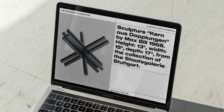
Sequel Geo was designed by Oliver Jeschke, Max Bill and published by OGJ Type Design. Sequel Geo contains 62 styles and family package options. The font is currently #24 in Hot New Fonts.
Sequel Geo is a geometric/grotesque hybrid superfamily, influenced by formalized sans-serif typefaces from Germany and Swiss modernist type design-particularly Max Bill’s Greek styled lettering.
5 subfamilies and 41 individual fonts allow for a wide range of typographic expressions. Sequel Geo‘s hallmark features, such as the circular “G” and punctuation, simple “t”, and two-story “a” turning one-story in bolder weights, persist throughout all styles. But the formal and functional differences between subfamilies let you really fine-tune your layouts.
The three optical sizes of the core collection, “Body Text”, “Headline”, and “Display”, boast optimized spacing for the intended use. “Wide” packs some extra punch with 7 display-oriented styles. Finally, the 10-font “Pure” subfamily pushes to the Geometric side, replacing horizontal and vertical stroke endings with angular ones and simplifying letterforms.
Sequel Geo is a journey through time and space. From 1920s Germany to 1950s Switzerland. All the while, its archetypal shapes are neutral yet confident, its appearance is classic.

