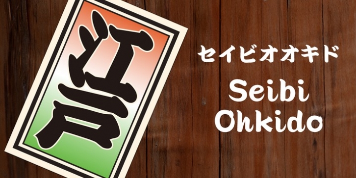
Seibi Ohkido was published by Nihon Literal. Seibi Ohkido contains 1 style.
It is a font based on ‘yose-style characters’ used in entertainment during the Edo period for signboards and the rankings of rakugo performers and flyers to attract customers. Kanji in the original yose-style characters is balanced with kana, and is made easier to read by controlling brushstrokes at oblique angles, rising to the right. While the font is arranged in a contemporary style tailored to both horizontal and vertical typesetting, you can still enjoy the essence of handwritten yose-style characters.
江戸時代ã«ä½¿ç”¨ã•ã‚ŒãŸæ¼”芸文å—ã§è½èªžã®çœ‹æ¿ã‚„番付ã€å®¢å¯„ã›ã®ãƒ“ラã«ä½¿ç”¨ã•ã‚ŒãŸã€Œå¯„å¸æ–‡å—ã€ã‚’ベースã«ã—ãŸæ›¸ä½“ã§ã™ã€‚寄å¸æ–‡å—ã¯èˆžå°èŠ¸èƒ½ã§ä½¿ã‚れる勘äºæµã¨ã€æç¯ã‚„åŠçºã«ä½¿ã‚ã‚ŒãŸå—体ã®æŠ˜è¡·ã§ç”Ÿã¾ã‚ŒãŸæ–‡å—ã¨ã„ã‚ã‚Œã€ã€Œæž ã„ã£ã±ã„ã«å¢¨ãŸã£ã·ã‚Šã®å¤ªã„ç·šã§ãƒ•ãƒˆã‚³ãƒï¼ˆéš™é–“)を埋ã‚ã¦æ›¸ã= 空å¸ãŒãªã„よã†ã«ã€ã€Œå³è‚©ä¸ŠãŒã‚Šã«æ›¸ã= ã¾ã™ã¾ã™ç››æ³ã«ã€ã¨ç¸èµ·ã‚’æ‹…ã„ã 装飾文å—ã§ã™ã€‚セイビオオã‚ドã¯ã€æ‰‹æ›¸ãレタリングã‹ã‚‰å¼•ã継ãŒã‚ŒãŸå¯„å¸æ–‡å—ã§ã™ã€‚寄å¸æ–‡å—本æ¥ã®æ¼¢å—ã¨ã‹ãªã®ãƒãƒ©ãƒ³ã‚¹ã®é•ã„ã‚’æ•´ãˆã€å³è‚©ã‚ãŒã‚Šã‚‚ãŠã•ãˆã¦èªã¿ã‚„ã™ãã€ã‚¿ãƒ†ãƒ¨ã‚³ã§ã‚‚組ã¿ã‚„ã™ãç¾ä»£é¢¨ã«ã‚¢ãƒ¬ãƒ³ã‚¸ã—ã¦ã„ã¾ã™ãŒã€æ‰‹æ›¸ãã®å¯„å¸æ–‡å—ã®ã‚ˆã†ãªçµ„ã¿ãŒã§ãã¾ã™ã€‚

