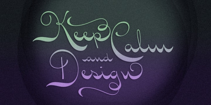
Seashore Pro was designed by Alejandro Paul and published by Sudtipos. Seashore Pro contains 1 style.
A feminine, graceful script whose thicker horizontals create a wave-like rhythm – hence the name. Seashore is loosely based on an ‘eccentric’ (left-leaning) penmanship style of the late 19th century. Used mainly by professional ‘engrossers’ in certificates and tributes, or by society ladies in their stationery and invitations, it sent a message of true refinement, as the style would have been only been mastered after the more common business, Spencerian, and standard ornamental styles. In fact, unusual script styles were in such demand that type foundries of the era exploded with metal-type knockoffs of increasing fanciness.
Seashore includes a wide variety of swash capitals, alternate endings, and contextual ligatures, over 900 glyphs in all. Seashore is best used in short display settings – in names and addresses on formal invitations, in menus and food packaging, or fashion and beauty contexts.

