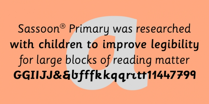
Sassoon Primary was designed by Rosemary Sassoon, Adrian Williams and published by Sassoon-Williams. Sassoon Primary contains 6 styles and family package options.
The Regular typeface was researched with children, for children and developed specially for use in children’s reading books – bridging the gap between reading and handwriting. Many other uses have been found for these legible and friendly letters, with alternative teaching letters included in each font. Modern typefaces have shortened ascenders and descenders to help fit as much text as possible into a page, but words lose their shape. This may not trouble literate adults but it is quite a different matter for children struggling to read. These friendly characters were the result of asking young children what kind of letters they found easiest to read – and then including features like extended the ascenders and descenders. The slight slant makes blocks of text easier to read.
Free to download resources
How to access Stylistic Sets of alternative letters in these fonts

