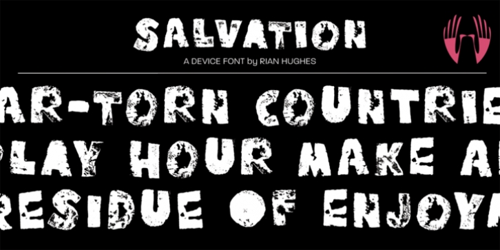
Salvation was designed by Rian Hughes and published by Device. Salvation contains 1 style.
Rough and ready, bold and urgent.
Or playful and fun in bright colours.
The original letters were cut from actual potatoes, then scanned in and converted to vector outlines. Lighter and more heavily inked versions were used for the three variants.
Using Opentype character-substitution technology, Salvation rotates through three versions of each letter to create a naturally uneven printed effect.
Unlike hot metal type, the potatoes were cut the right way around. This produced reversed prints, which were then flipped back in Photoshop.
Originally produced for Hughes’ Get Lettering activity book, the font was then extended to cover numbers, punctuation and full European language support.

