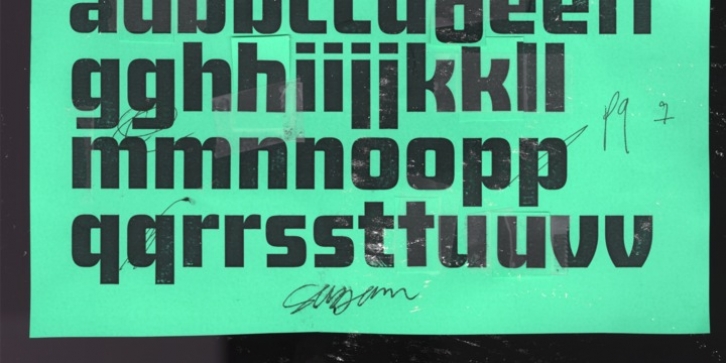
Sagan was designed by Michael Cina, Karl Engebretson and published by Associated Typographics. Sagan contains 14 styles and family package options.
Sagan was designed as an alternate to Ramsey; you could call them brothers. It was drawn, redrawn, and expanded on, to put it lightly. It boasts 770 glyphs in each weight, covering all European languages, and also contains an extended Cyrillic. Sagan provides advanced typographical support with features such as case-sensitive forms, old style numerals, fractions, and many alternate glyphs.
Like all of our typefaces, Sagan is fun to use.
Sagan has 7 weights, with accompanying italics for each weight, ranging from Extra Light to Black. It is ideally suited for branding, editorials, advertising, packaging, posters, billboards and digital screen design. Sagan will work hard for your brand or project. Make a statement that demands notice.

