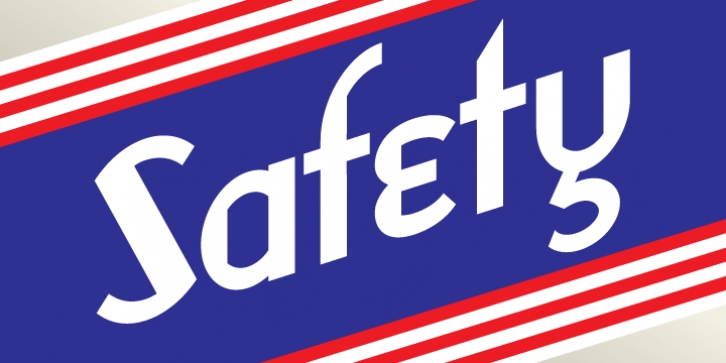
Safety was designed by Daniel Pelavin and published by Pelavin Fonts. Safety contains 1 style.
Safety is rendered with vertical stress and purely geometric shapes. The letterforms exhibit a stylized, precision typical of works from the Machine Age which had its greatest period of influence between the two world wars and celebrated the supposed triumphs of the late Industrial Age including mass production, skyscrapers, radio & phonographs, hydroelectric power and streamlined styling in product and industrial design.
It is based loosely on an Art Deco display style letter known most popularly as Broadway or Manhattan but, having existed in a multitude of incarnations from showcard lettering to neon signs for a century.

