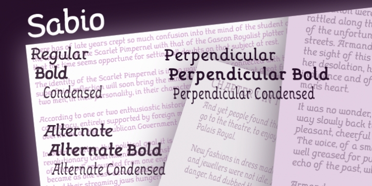
Sabio was designed by Paul Lloyd and published by Greater Albion Typefounders. Sabio contains 9 styles and family package options.
I regard Sabio as an evolutionary face. By this I mean that it merges elements of script and Roman design into one elegant whole.
The design was ‘evolved’ somewhere between these two classic approaches. The resulting family of faces makes an excellent display family, but is also clear and legible at small sizes and can be used as a text face with a distinctive flair.
Sabio is a wonderfully flexible face that can sit happily alongside artwork that owes its inspiration to any era from the Art Deco onwards. The regular form is gently and subtly oblique, and the glyphs have a slight hint of swash about them. Alternate and perpendicular forms are also offered. The regular, alternate and perpendicular forms are all in turn offered in regular, and bold weights as well as in a condensed form.
All in all Sabio is a humanist face with which almost anything can be done offering flair and elegance for almost any project. Whether it’s a distinctive way of setting paragraph text, or poster work that’s eye catching yet flowing and clearly legible, Sabio offers the answer.

