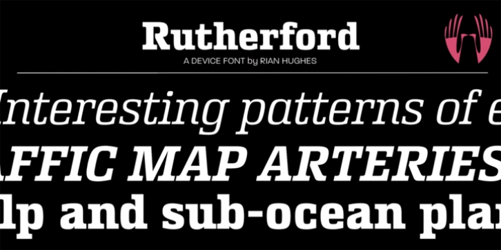
Rutherford was designed by Rian Hughes and published by Device. Rutherford contains 10 styles and family package options.
Rutherford is clear, robust and authoritative, and reads well at small text sizes while also having the required heft for larger headlines. A wide range of weights makes it a versatile choice for magazines, branding, brochures and advertising.
A slightly condensed obround serif with squared stroke terminals. The t, j and f curve around to harmonize with the terminals on the a and g, as does the tail of the Q. The italic incorporates cursive forms on the ends of the lower right and upper left strokes, and uses a single-story a.
Includes full European Latin support and alternate designs for the Q and g in all weights.

