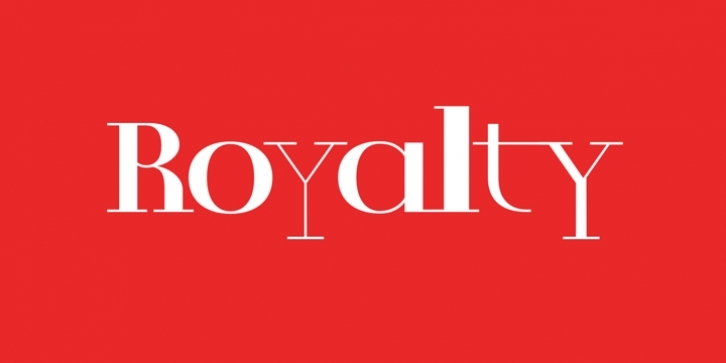
Royalty is not a font design, it is a font concept. The characters are designed to form typographic patterns, within which the words are still discernible. All character shapes are based on geometric elements, but the geometric expression is softened by using softer, almost calligraphic treatments of individual parts of a glyph. This juxtaposition of geometry and calligraphy is reminiscent of medieval manuscripts when Royalty is set in text. The spacing of the font is set to be deliberately disturbing, encouraging new shapes and textures to emerge. The counter-space becomes all-important – it’s not important what is read but what is seen.
The four styles of Royalty are designed to be interchangeable. All the horizontal strokes retain the same thickness throughout the font family, meaning that letters from the different styles can be joined without interrupting the flow of the connections. Royalty allows the designer to be freed from the constraints of functionality; words become images, sentences become ornaments.
The Standard Edition includes a complete Latin A Extended character set.

