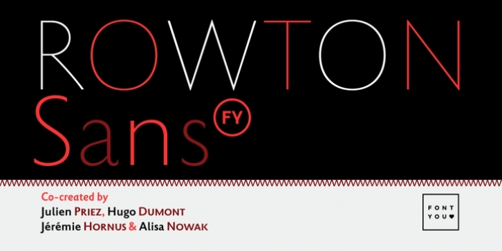
A tribute to Arthur Eric Rowton Gill.
Rowton FY digs its roots in Eric Gill’s views on typography in his book “An essay on Typography”. This typeface has the very British feel of the 20th century. Taking as inspiration the calligraphic illustrations of the book, Julien Priez, Hugo Dumont, Jérémie Hornus, and Alisa Nowak, shaped up a new design. This sans-serif is tuned for text setting (with small capitals) but can also be efficient at larger sizes, specially with its lighter weights, and does a perfect job for signage or logos.
Taking the same source of inspiration a stencil display typeface for bold and bespoke titling is also in the making.
Rowton Sans FY has six weights (from Hairline to Bold), with gently sloped italics companions that have details of cursive handwriting. ExtraBold and Black weights are also part of the project and will be released later.

