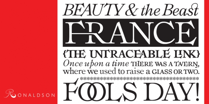
Ronaldson was designed by Rebecca Alaccari, Patrick Griffin, Alexander Kay and published by Canada Type. Ronaldson contains 3 styles and family package options.
On April 29, 2006, Simone Chisena uploaded to the WhatTheFont forum a scanned two-page spread from a 1970s Italian gardening book, asking for the identity of the face used on those pages. Rebecca Alaccari had been spending her daily lunch hour at that forum for a few weeks then. The face used on the pages was identified as the American classic Ronaldson Old Style, a MacKellar, Smith & Jordan metal face dating back to 1884. Ronaldson Old Style was never digitized. A conversation about it started on the forum, and the rest was a great 22-month adventure in type history, the result of which is this digital version of what was the best selling and most unique American text face of the nineteenth century, all the way into the 1920s.
The metal Ronaldson was the magnum opus of Alexander Kay, a first generation Scottish-American expert punchcutter whose résumé included clients no less historically prominent than Henry Caslon, Vincent Figgins and the Stephenson Blake company. His expertise at cutting roman faces was world-renowned. This expertise is quite evident in Ronaldson Old Style’s confident serifs, which loom from the T like an eagle’s wings, and point out of the C, E, F, G, L, S and Z like the proverbial thorns on a rose. Only a master handcutter would be able to include such ornamental traits in a typeface yet still succeed in creating such a cleanly readable face. The popularity of Ronaldson Old Style around the turn of the century can still be seen in new editions of novels from that era, like the recent Arion Press letterpress edition of Edith Wharton’s The Age of Innocence.
This digital version of Ronaldson revisits the original sizes, where some of the letter forms varied considerably from one size to another, with a more technologically current, scalable type approach. The forms that were originally cut in display sizes are included in this digital version as alternates. The metal Ronaldson was only a roman style in different sizes. There was a sloped (oblique) version that was mostly deemed unworthy of being a counterpart to the roman, so there were plenty of instances where other old style italics were used with it instead. But even in those instances, the italic always seemed loose and clunky compared to the attractive color and evenness of the roman. In this digital version, a brand new italic was made, as well as a bold weight. Roman and bold small caps were also added, along with oldstyle, tabular, superior and inferior figures, and fractions of both the vulgar and nut varieties. Then plenty of ligatures and extra alternates were added.
Ronaldson is available in all popular font formats. The OpenType version of each style combines all the style’s fonts into a single one. The roman and bold faces contain nearly 1200 characters each, and the italic font contains over 570 characters.
Pre-digital type history being what it is, relying mostly on word of mouth and documents that were lucky enough to survive wars, industry shifts and migrations of entire populations, it was quite difficult to track down the exact history or designer of Ronaldson Old Style. Things became much clearer when keen American metal type enthusiast (and very much an expert on the subject) Stephen O. Saxe provided us with many scans and further information about Alexander Kay from his archive of an old American trade magazine called the Inland Printer. Philippe Chaurize, another WhatTheFont forum regular and typeface identifying guru provided us with even more specimen scans and pointed us to the “sloped” version of Ronaldson.
While our work was well under way on the digital version, we were contacted by Rebecca Davis, an American graphic designer who is actually married to Alexander Kay’s great great great grandson. Rebecca generously provided specimen scans from the family chest, and photos of a most breathtaking hand-lettered rendition of the Lord’s Prayer, done by Alexander Kay himself. Needless to say, Canada Type couldn’t have brought this American beauty back to life without the help of the people mentioned here. Thanks to them, this digital version of Ronaldson feels more like the pleasant melancholy that comes at the end of a global party, rather than a simple collaboration on a typeface design.
We’re quite proud of the work we’ve done here – not only reviving a typeface, but having the honor to develop one so imbued with history, meaning and such character to have eluded everyone before us. We hope you discover its unique qualities with your audience as well.

