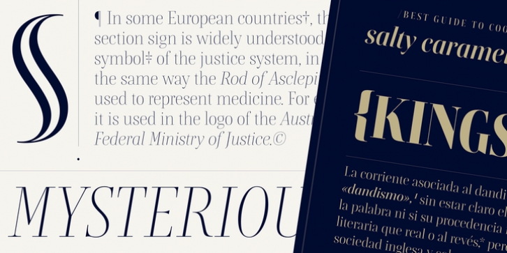
Rion was designed by Barbara Bigosińska and published by Indian Type Foundry. Rion contains 12 styles and family package options.
Rion is a high-contrast ‘modern’, or Didone-style font family, with a calligraphic flourish. It is intended for typesetting headlines in editorial design settings, as well as signage, the larger texts in exhibition graphics, or any other place where you need big, elegant-looking type. Rion takes inspiration both from straight-axis nineteenth century typefaces and pointed-pen calligraphy. Its letterforms contain a high degree of stroke-contrast; this gives them a look of sophistication. The family includes six weights, ranging in style from Light through Black. Each weight has both an upright font and an italic on offer. The fonts’ default numerals are proportionally-spaced oldstyle figures. Lining figures are also available, via an OpenType feature. Rion‘s characters are all a bit condensed; this narrow feeling is especially present in the fonts’ uppercase letters. The ascenders of the lowercase letters rise slightly above the tops of the capitals. In the upright fonts, the ‘a’ and the ‘g’ are double-storied. In the italics, they are single-storied. Each font includes small caps, and 13 f-ligatures, too. Special characters in the fonts – such as the hashtag and the @-symbol, as well several punctuation marks and mathematical glyphs – are drawn with thin, monolinear hairline strokes, allowing them to disappear into the background somewhat, and let the real alphabetic characters shine more prominently. Rion is the work of Barbara Bigosinska, a Polish type designer living in the Netherlands, who is a graduate of the MA Type & Media programme at the Royal Academy of Art (KABK) in The Hague.

