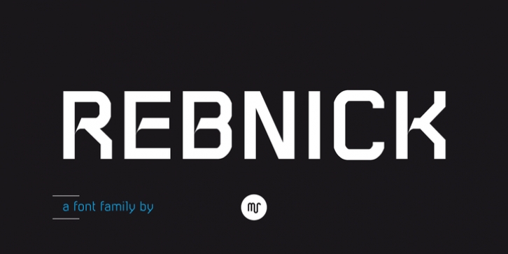
Rebnick was designed by Michael Reichen and published by Mr. Rebnick contains 4 styles and family package options.
Structured, ordered and balanced. But it isn’t your ordinary structured, ordered and well-balanced font. Rebnick is a sans serif typeface where in the early design process, the adjacent stems and bars weren’t weld seamlessly and perfectly. You can actually find glitches which were carefully transformed into a custom language in it’s own and later became the coherent generic rule that keeps everything together. In display sizes, the ink traps give the font’s own character, while in small text sizes they create a good legibility and a well-balanced ratio between the black and white spaces.

