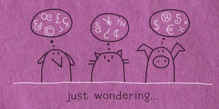
Reading was designed by Amy Dietrich and published by Atlantic Fonts. Reading contains 1 style.
Reading is fun; legible with a playful wiggle, a bit of texture, and a lively set of double-letter ligatures. Reading wants to be read aloud and sounded out – lightened by comic relief and sweetened by a bit of style. The upper case is relatively straight, the lower case – slightly jumbled, and Reading‘s numbers have excellent curls.

