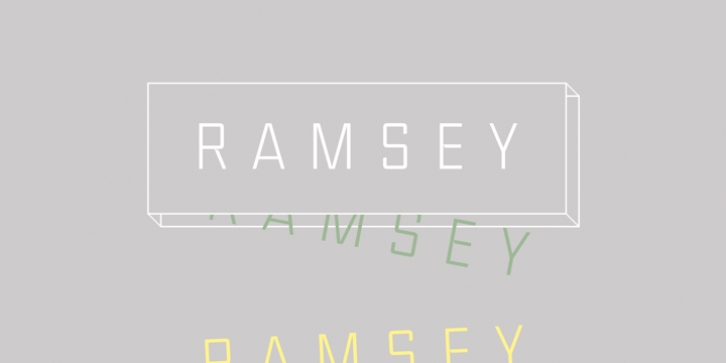
Ramsey was designed by Michael Cina and published by Associated Typographics. Ramsey contains 12 styles and family package options.
Boring Sans? No way!
Ramsey‘s tasty little details are what make it the perfect display font for both print and web. With strong structure and a warm personality, this typeface is a stout but refined workhorse. Ramsey‘s strength really shines when it comes to identity work, headlines, and anything that requires a bold statement. This typeface’s 12 styles provide expansive versatility on and off screen, while it’s robust spacing and kerning creates a cool and even grey tone.
I spent a couple of years drawing and redrawing what would eventually become Ramsey. What started off as a sketch based on a record cover design became increasingly complex as I continued to revise and retweak. Soon I found myself working on it every night. The largest challenge of any typeface is to give it a unique personality that stands on it’s own. Ramsey has this in spades. What you see in this typeface is the result of 3+ years of meticulous reworking and refinement. It’s my most solid typeface to date.

