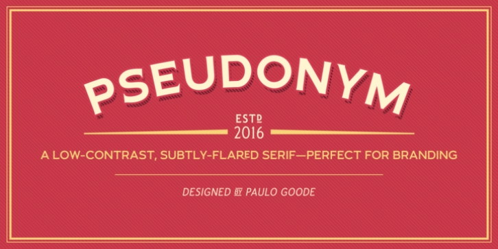
Pseudonym was designed by Paulo Goode and published by Paulo Goode. Pseudonym contains 24 styles and family package options.
Pseudonym is a low-contrast, subtly-flared serif available in four weights across three styles in both roman and italic.
As with all of my typeface designs, I am creating fonts that I would use myself for branding purposes-typefaces with style and purpose that are intended for use in creating logos and distinctive branding typography. I wanted to create a typeface that had incisive flared serifs combined with the strength and solidity of modern grotesque faces. The result is Pseudonym, which I feel has great presence, style and legibility. Although I must admit, I had to tone down the flared serifs during the design process in order to achieve that 🙂
I’m sure you will have great fun playing with some of the Open Type features that I’ve added to Pseudonym. There’s a full set of true small caps with their corresponding diacritics and figures. There are also a number of discretionary ligatures, these are chosen from the glyphs palette in your layout app to replace pairs of standard characters. You’ll also enjoy making use of the catchwords – these have been created to harmonise with each style, again, giving you more flexibility and scope to create some innovative typography. Finally, there are some alternate characters for /C/D/O/. You may wish to use these when creating logos that include standard contractions for limited, number, incorporated, etc.
Key features:
• Pseudonym is a low-contrast, subtly-flared serif that has great presence, style and legibility
• 3 styles – Narrow, Regular and Wide
• 4 weights in roman and italic:
• Light | Regular | Medium | Bold
• Full set of small caps with diacritics and figures
• 30+ discretionary ligatures, catchwords and alternate characters
• Full European character set
• 600 glyphs per font

