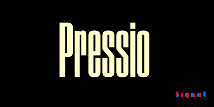
Pressio was designed by Max Phillips and published by Signal. Pressio contains 20 styles and family package options.
Pressio is a study in doing things backwards. We began with the weight that’s usually drawn last: the ultra-compressed black. This was squashed down vertically in increments to make the compressed, condensed, and regular widths, then hollowed like a dugout canoe to produce the lighter weights. The narrower bold cuts are inspired by the great mid-century skyline sanses. The widest cuts are stark, idiosyncratic, and intense. In between, 20 styles in five weights and four widths provide a broad range of expression. Forms are strict and modular. X-height is high. Curves are subtly superelliptical, and square counters add crispness. For those who prefer it, a set of stylistic alternates is available to round some of the unexpectedly sharp corners of letters like S, s, and a. Case-sensitive punctuation and delimiters are included, and a full range of diacritics provides support for over 130 languages. And it goes well with its sister family, Pressio Stencil.
A guide to Pressio‘s stylistic alternates and special characters can be downloaded here.

