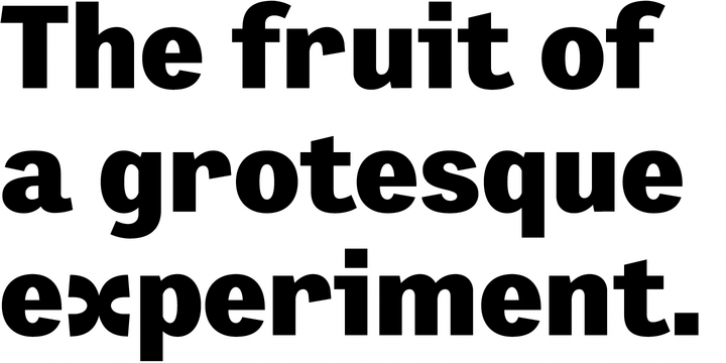
Preface was designed by Nick Shinn and published by Shinntype. Preface contains 12 styles and family package options.
Preface vs. Helvetica/Futura/Gill: a different strategy of text color.
Whereas the established classes of sans serif typeface achieve a dynamic balance between stroke and space by combining a diversity of letterform with an evenness of fit, Preface switches the emphasis, driving out diagonals to create a dominant harmony of curves and perpendiculars, matched with a greater variety of inter-character space shapes-the result of extra width introduced in the “f” and “t”, and by the openness that accompanies the wide tails of the ” a” and “l”, the long ear of the “r”, and the serif of the “i”.
En masse, and in keeping with the present trend in typography, Preface exhibits a coarser texture than the traditional sans serif faces, but one that is nonetheless even and precise.
With tabular, oldstyle figures.

