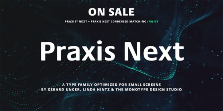
Praxis Next was designed by Gerard Unger and published by Linotype. Praxis Next contains 36 styles and family package options.
Praxis® Next has the same robust shapes and proportions as the original 1976 Praxis design. Its large x-height, substantial counters and open apertures guarantee high levels of legibility and reading ease in print and on screen. More weights, condensed designs and true cursive italics differentiate Praxis Next from the older design.
Praxis Next shines where space is at a premium. The regular designs are modestly narrow while the condensed typefaces perform with grace in the most crowded of environments. The bold designs create powerful headlines and banners and the lighter weights are ideal for both long and short-form text copy. Because of its many weights and proportions, Praxis Next is also an ideal design to build a brand identity.
Pair Praxis Next with old-style designs like Bembo® Book and Stempel Garamond to create a dynamic typographic contrast. Or complement the design with its serifed counterpart, Demos® Next. Unger also drew ITC Flora® as an alternative italic design. Looking for something a little different? Pair Praxis Next with Masqualero.

