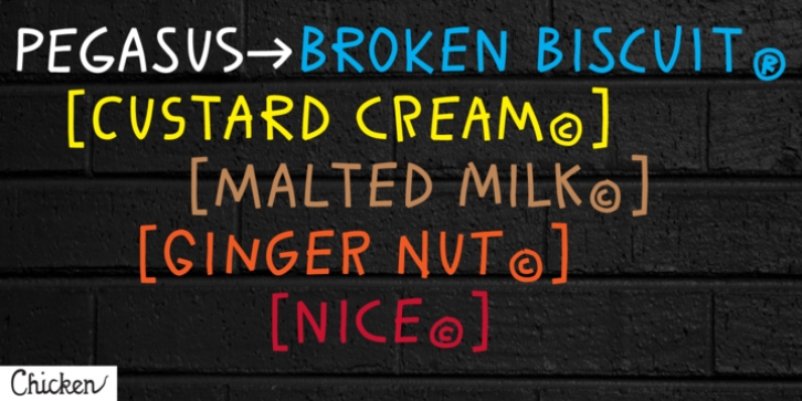
Pegasus was designed by Tim Barnes and published by chicken. Pegasus contains 4 styles and family package options.
Pegasus scrapes the DNA of a great twentieth century painter who scattered text across his work like no other… not any kind of facsimile, but tough, playful, adaptable display type forged from the bones of a unique writing hand.
Three weights – Skinny, Domestic and Peso – each offer five alternates for each letter, three for each numeral and multiple versions of many punctuation and other symbols.
Letters are uppercase only with the lowercase providing one of the alternate forms of each letter… with OpenType Contextual Alternates switched on, you get automatic variation between the two… and you can manually throw in wilder variations from the remaining alternates. Some repeated punctuation – periods, question marks, etc. – are automatically varied too.
OpenType Stylistic Set 1 switches to a rowdier selection from the alternates… Set 2 flips all the E’s to distinctive ‘skeleton’ alternates… Set 3 introduces automatic variation into numerals.
Save some $$$ by purchasing the Whole Livery Line – all three weights at a nice discount… or, if you’re really hurting, Cheapskate offers just two alternates for each letter and a single set of numerals.

