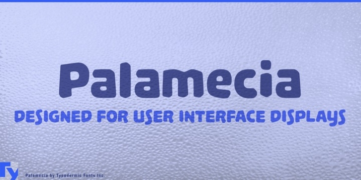
Palamecia was designed by Ray Larabie and published by Typodermic. Palamecia contains 1 style.
Palamecia was designed to endure scaling and blurring on various user interface displays. At first glance it looks like a cartoon typeface, which was the goal, but the design of each character was informed by the effects of pixel scaling on legibility. Rather than using pen strokes as a base for each letter’s design, Palamecia‘s shapes were designed as cutout silhouettes which were gradually whittled and chipped away.

